
Field notes · 5 min read
5 Fleet Wrap Design Mistakes That Cost Las Vegas Operators Calls
A wrap that generates 50,000 daily impressions across the Las Vegas valley but no phone calls is a $4,000 mistake. Here's what separates wraps that convert from wraps that just look like ads.
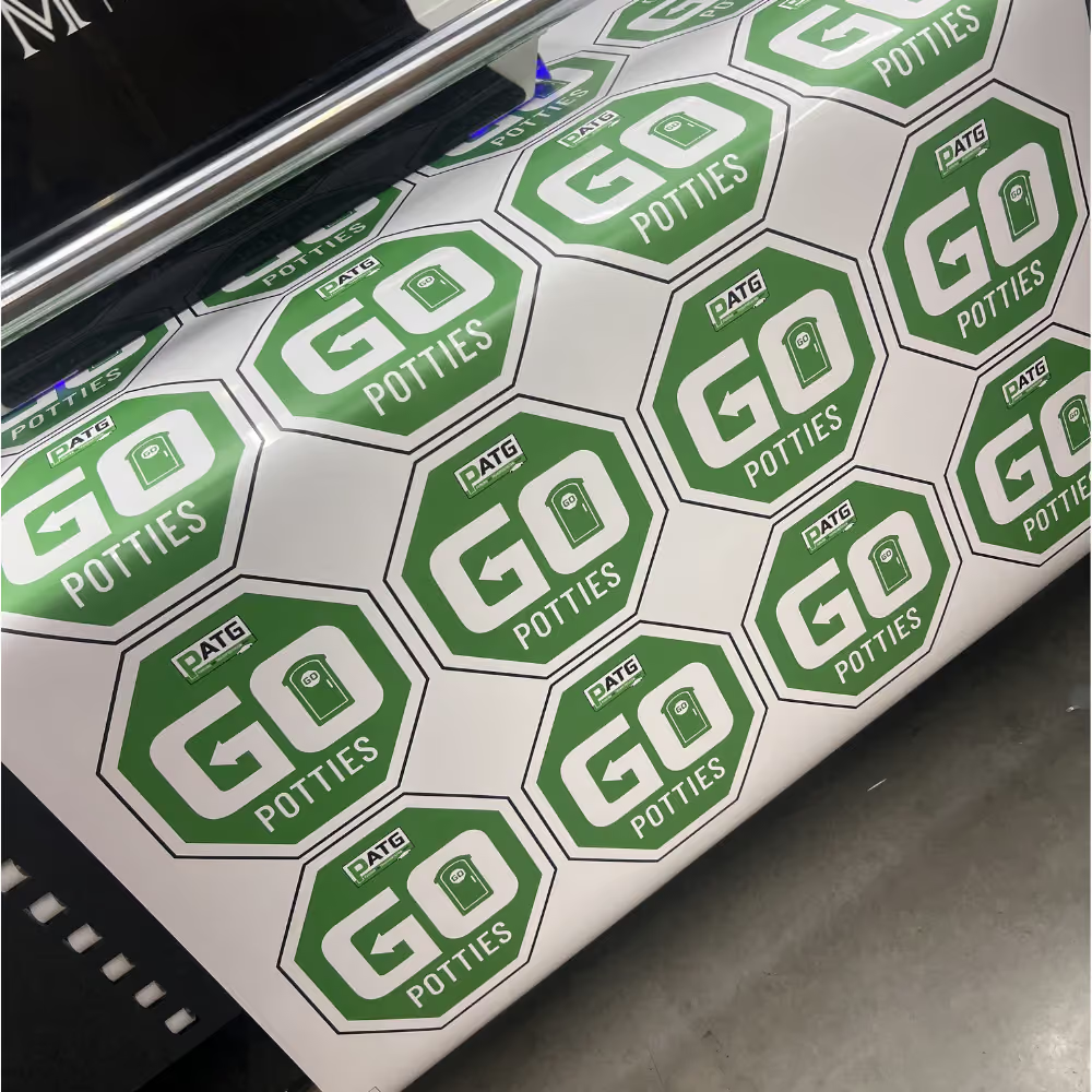
A fleet wrap has one job: generate inbound calls. Impression counts are interesting; the only metric that matters is whether someone driving behind your truck on the 215 or pulling up next to it at a Sahara light picks up the phone. We've designed wraps for Las Vegas service operators that drive 30+ inbound calls a month per vehicle, and we've inherited rebrand projects from competitors whose wraps generate effectively zero. The difference comes down to five repeatable design mistakes.
Mistake 1: phone number is illegible at 30 feet
Most wraps put the phone number in a 4-inch font on the side panel, which is unreadable to a driver in the next lane at 35 mph. Phone numbers on fleet vehicles should be 8–12 inches tall on the rear and at least 6 inches on the sides, in a high-contrast color block. If your phone number requires squinting in your own Vegas parking lot, it requires squinting on the road. Fix: design the phone number first, sized for legibility at 30 feet, and lay the rest of the wrap around it.
Mistake 2: no clear answer to 'what do they do?'
A wrap that says 'Acme Services LLC' communicates nothing. The driver behind you should know in two seconds whether you do plumbing, HVAC, pest control, or roofing - because they only call when they need that specific service. Vague brand names without a service descriptor lose 80% of the call potential. Fix: every wrap needs a service line in legible type - 'PLUMBING & DRAIN', 'HVAC REPAIR & INSTALL', 'ROOFING & GUTTERS'. Generic taglines like 'Quality Since 1987' don't convert.
Mistake 3: design that doesn't survive distance
Wraps designed at desktop scale look great on a monitor and disappear on a truck. Fine illustrations, gradient logos, small icons, and busy backgrounds all collapse into mud at 50 feet. The wrap needs to read clearly from across a Vegas parking lot - meaning bold shapes, high contrast, and three to five visual elements maximum. Fix: print a 4x6 inch version of the design and look at it from 20 feet away. If you can't immediately read the service line and phone number, the full-size wrap won't work either.
Mistake 4: rear of vehicle treated as an afterthought
The rear of your truck is your highest-value billboard - every driver stuck behind you in Las Vegas traffic looks at it for 30 seconds to several minutes. Most wraps cover the rear with a small logo and call it done. The rear should carry your largest phone number, your clearest service line, and your strongest call-to-action. Fix: design the rear as a standalone ad first, then design the sides. The sides get glances; the rear gets sustained attention. Use it.
Mistake 5: no measurable call-to-action
'Call us today' is not a call-to-action; it's a wish. A working CTA gives the viewer a specific reason to call right now: 'Same-day Las Vegas service', '$49 diagnostic', 'Free estimates 7 days', 'Licensed and insured - call before 5pm'. Add a tracking number specific to the fleet so you can measure exactly how many calls the wrap is driving, separately from your other channels. Fix: pick one specific offer, put it on the rear and one side panel in legible type, and route those calls through a tracking number. Within 90 days you'll know exactly what your wrap is worth - and you'll likely find it's the highest-ROI line item in your Vegas marketing budget.
"Impression counts are vanity. Tracked inbound calls per vehicle per month is the only fleet wrap KPI that matters."
More from Las Vegas Commercial Vehicle & Fleet Wraps
More commercial vehicle & fleet wraps guides
More from Solid · Las Vegas Commercial Vehicle & Fleet Wraps
More to explore
Industries we serve
Local coverage
Got a commercial vehicle & fleet wraps project in mind?
We'll help you scope it, price it, and ship it on time.
Get a quote